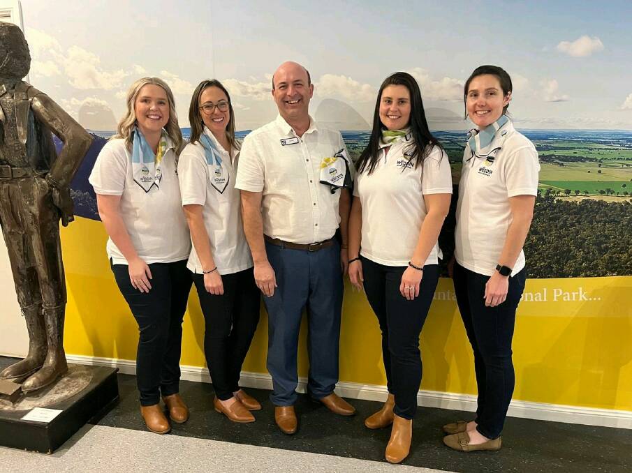
Weddin Shire Council have launched its new logo that has been in the works since 2017.
Subscribe now for unlimited access.
$0/
(min cost $0)
or signup to continue reading
The new logo encompasses not only the Weddin Mountains but the spirit of the whole Weddin Shire with its distinct colours.
"The various offerings of the region are shown in the logo as different segments that come together to create the full circle of Weddin Mountains Region," Weddin Shire Council economic development and tourism officer Claire McCann said.
Breaking down the logo, each aspect has its own meaning:
Wheel - Symbol of its central location, where you can base yourself and branch out to explore everything the Central West NSW region has to offer. It is also a symbol of cycling opportunities, and a nod to the heritage past, when wagon wheels helped many to establish the region.
Canola and Wildflowers - The abundance of canola crops and varieties of wildflowers throughout the region in spring.
Plants and Farmland - The patchwork landscape that lays across the regions plains and the uneven tops of the farmland.
Mountain Skyline - The Weddin Mountains which sticks out of the regions plains.
Bird Wildlife - Bird icon and bird in negative space represents the native bird wildlife that exists in the region.
Colours - The colour palette of the Weddin Mountains Region logo and brand reflect the natural landscapes as well as the history and heritage that the shire prides itself on.
In 2017 Weddin Shire Council tourism strategy changed and they developed a Destination Management Plan that would guide investment in the visitor economy.
A comprehensive plan was researched and developed in close consultation with the community and local stakeholders.
"This plan is important in that it recognises the role our villages have to play in the visitor economy, and this is demonstrated by the word Grenfell not being the main element of the new branding," Claire said.
"Instead, the main element became the Weddin Mountains, something that unifies the whole shire - a landmark that can be seen from all villages."
The main element of the plan was that it recognise the natural beauty of the area.
"The key point from the Destination Management Plan was a recognition that our shires natural assets were a strength we weren't maximising," Claire said.
"Inadvertently through the pandemic we have all now realised the strength of our natural product."
In December 2021 community consultation was undertaken in the process of developing a new meaningful brand for the whole shire.
"This new branding is one of the most visible outputs council has produced as a result of the Destination Management Plan, and the brand is now being rolled out across all tourism marketing collateral such as our Visitor Information Centre, a new visitor guide which will be launched in October and our fantastic new website which went live in July," Claire said.


